Some features of the new visualization of search graphs are provided below:
The legend for the search results is interactive in multiple ways.
You can toggle the display of the legend as ON and OFF. Click the desired legend to hide/unhide it. For example,
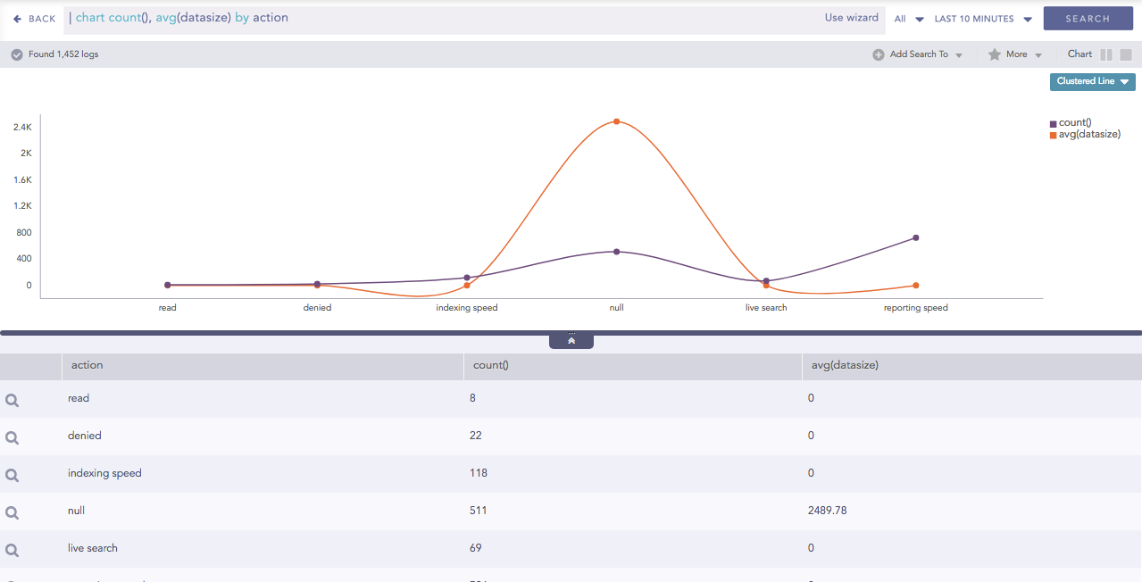
Clustered Line for Multiple Aggregation with Grouping
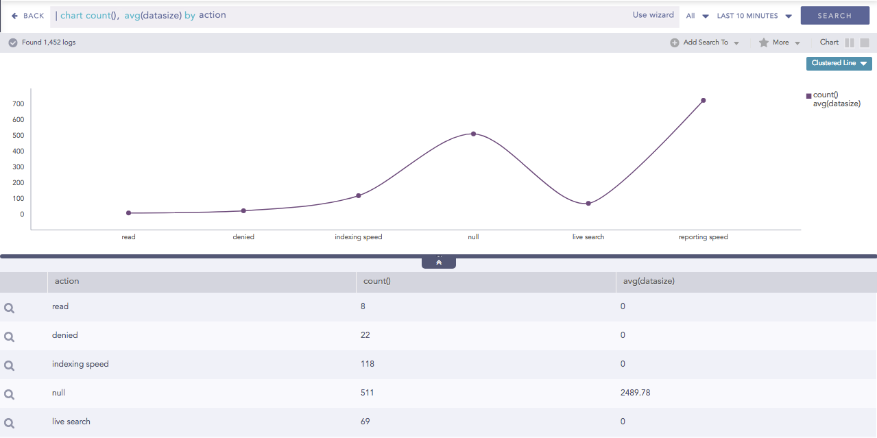
Click the legend of count() to hide its corresponding result.
Hidden Result of count()
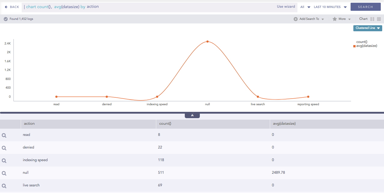
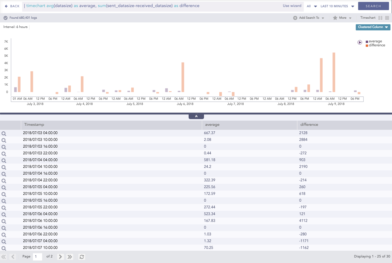
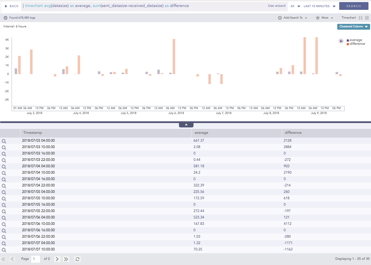
Click the legend of avg(datasize) to hide its corresponding result.
Hidden Result of avg(datasize)
The status of the legend (either ON or OFF) is saved for the result which is dynamically populated in the widgets in the dashboards.
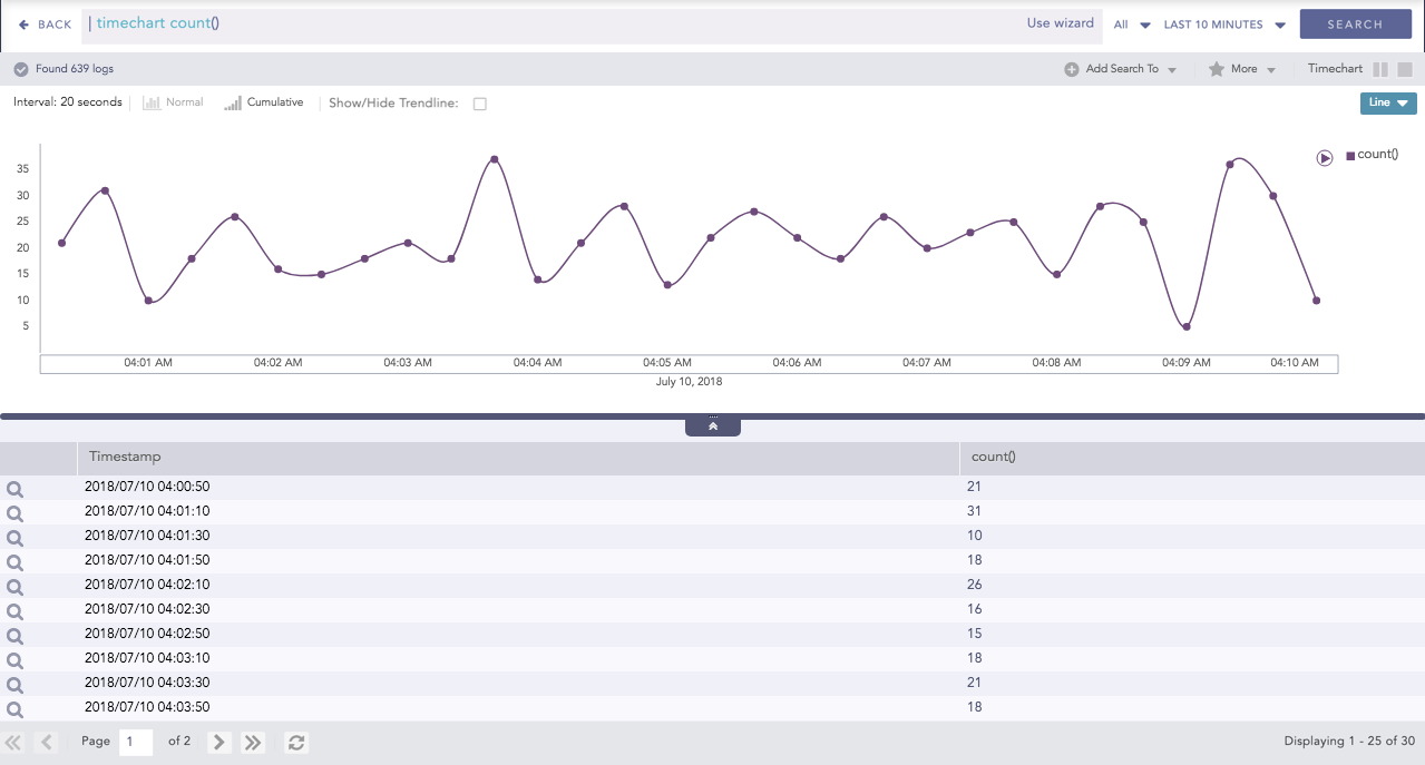
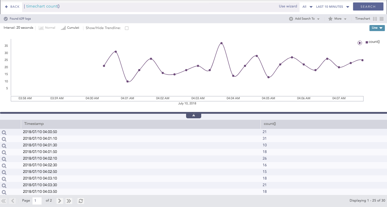
All the related data can be highlighted at once by hovering over the legend. If you hover the mouse over the legend of count() then all the data of average is highlighted.
Highlighted search result
The Pan and Zoom feature in the axes is provided for better visibility of the results.
Pan is the ability to click and drag the cursor over the search result visualization to select the desired area. With this feature, the axes can be moved to cover a larger area of the timespan of the search result.
Consider the following search result:
Search result (truncated on the y-axis)
If you click and drag the y-axis, it is displayed as in the following screenshot:
Search result (after panning the y-axis)
Zoom is the ability to expand and shrink the scale of the axis. With this feature, the scale of the axes can be zoomed in and out for better visibility of the search results.
Consider the following search result:
Default search result
If the you zoom over the axes individually, it is displayed as in the following screenshot:
Zoomed Axes
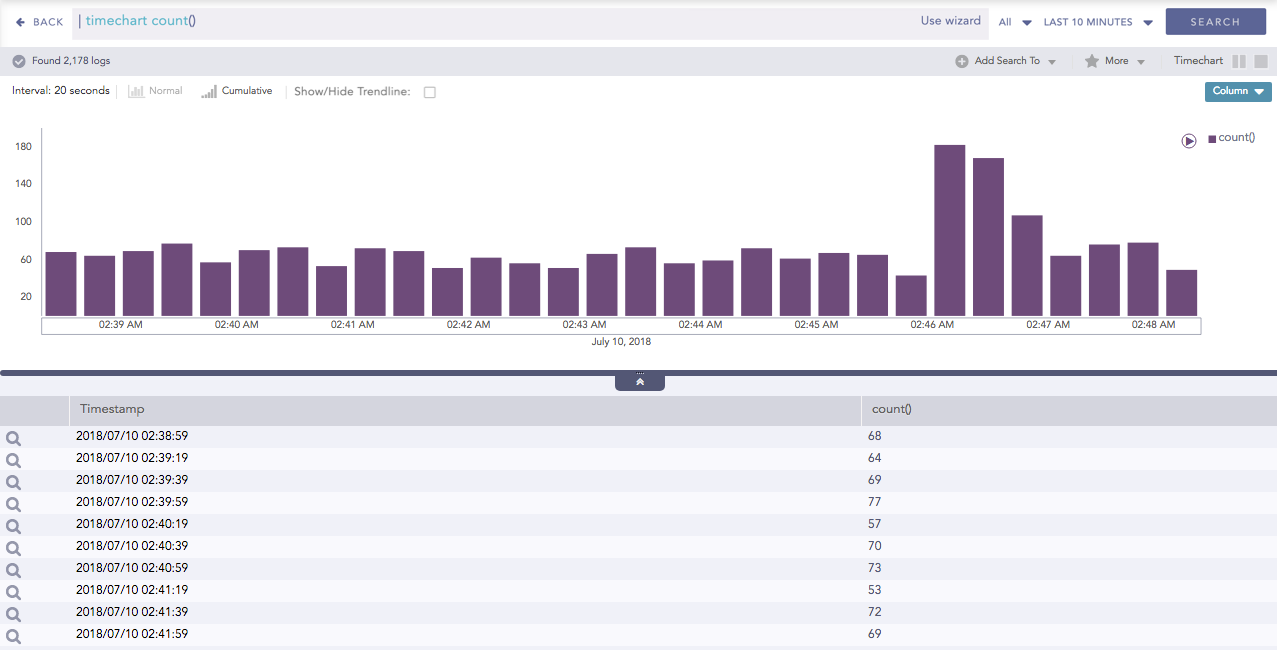
In the Timechart responses, a new feature called “Drilldown via Drag Box” has been introduced. If you click and drag the mouse inside the container, a transparent drag box appears. This drag box is movable and resizable.
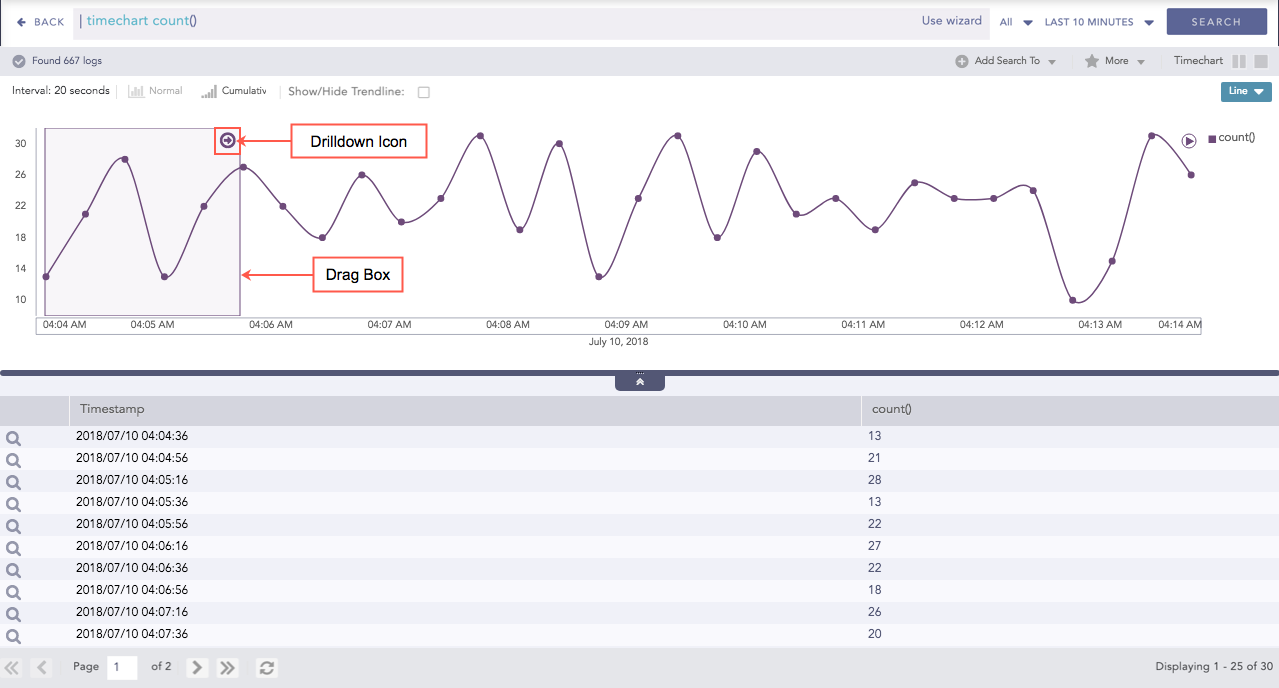
Drag Box in search
The main purpose of the drag box is to further drill-down within a custom time-range which is a subset of the previous time-range. Once the desired vicinity of the drag box is set, click the drill-down icon. This displays the search results of the particular time-frame tapped by the drag box.
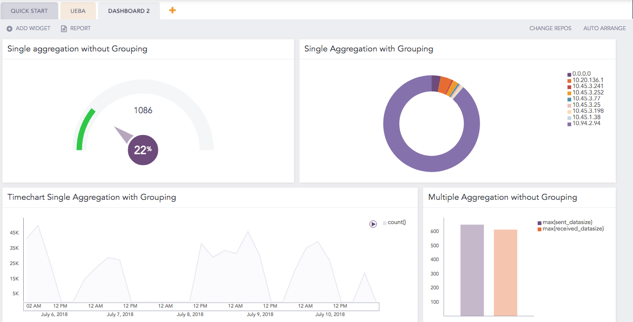
The axes label auto-adjusts as per the size of the container. This feature is especially useful for dashboards with many widgets where the size of a widget is user-configurable. Whenever you resize a widget or click the Auto-arrange option, the labels of both the axes auto-adjust as per the space occupied by the search graph whenever applicable.
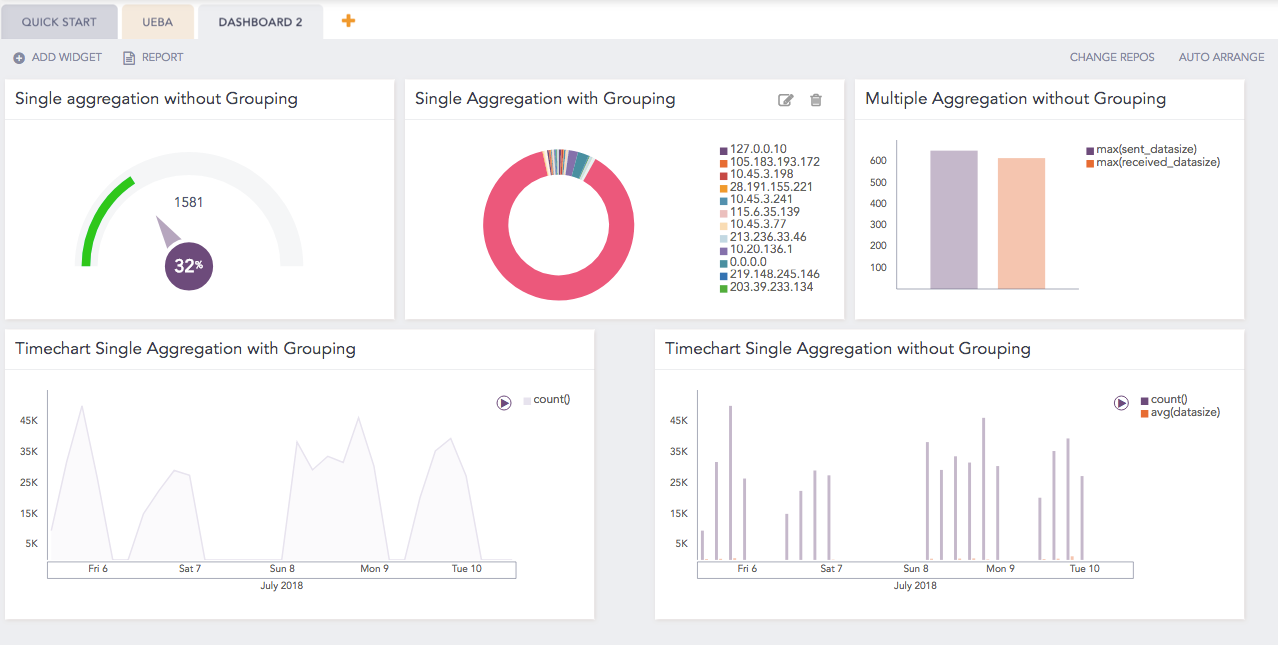
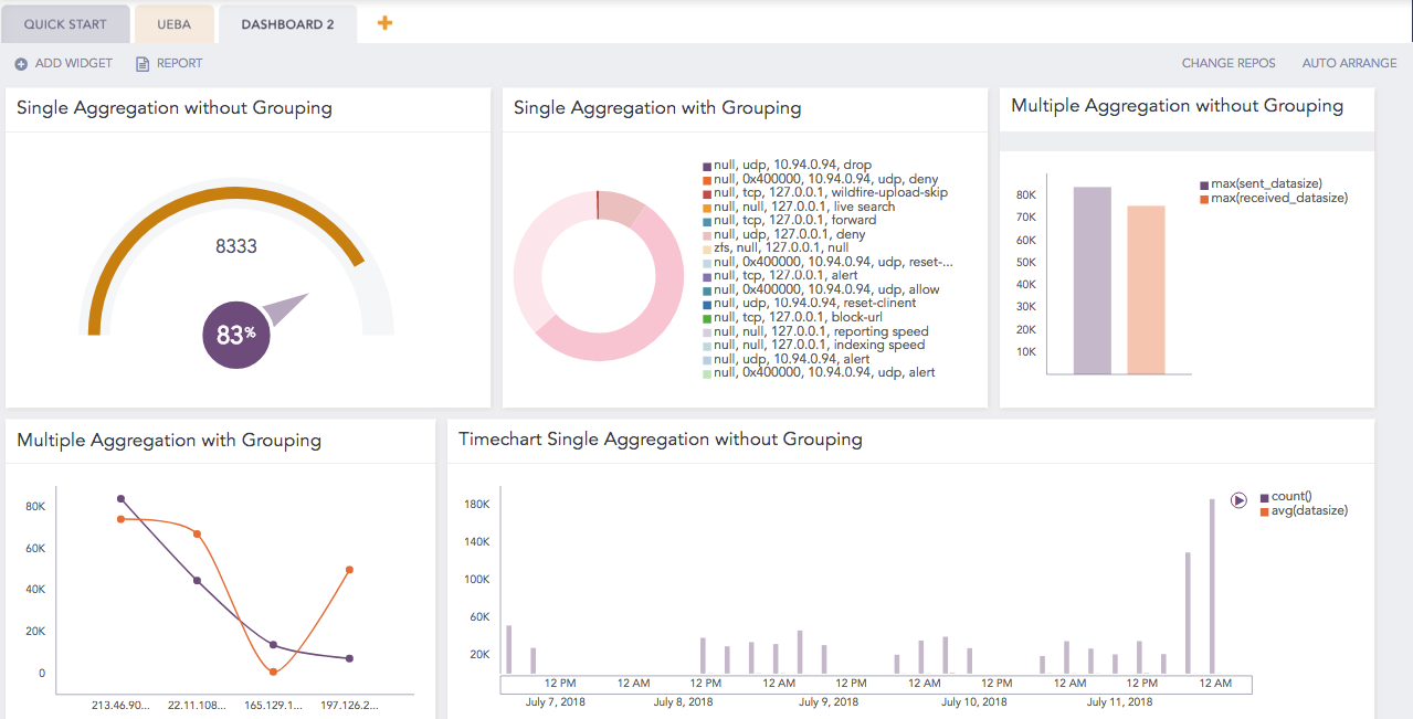
Consider the third widget (Multiple Aggregation with Grouping) of the following dashboard:
Default dashboard showing the hidden x-axis label
For the same dashboard, if the widget’s size is increased, the labels of the axes are auto-adjusted.
Auto adjusted axes label
The legend’s text auto adjusts as per the widget’s dimension. When the container’s dimension is expanded or shrunk, the legend’s text auto-adjusts without blocking the search result.
Consider the following dashboard:
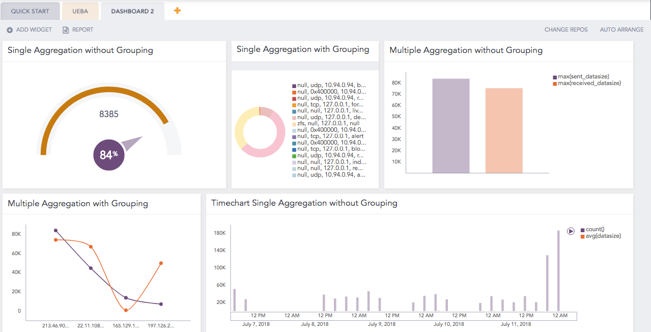
Default dashboard showing truncated legend
As you customize the size of a widget in the first row, you can see that the legend of the donut chart automatically adjusts.
Auto adjusted legend